Creating visions of connectedness, hope and optimism for a ground breaking recovery-oriented mental health facility
The Last Days of Judas Iscariot
Crafting a unique and contemporary visual identity for a student production at Burke Street Studios, Queensland Conservatorium, Griffith University
BTP Workspaces
Creating a large-scale mural for a new end-of-trip facility
Brisbane Youth Service
Taking a youth-focused design approach to support young people to prevent relapse of harmful alcohol and other drug use
Alumni Unleashed
Designing a new identity to celebrate the partnership between Griffith University and Surfing Australia
QCAAR
Providing Queensland College of Art, Griffith University students a platform to showcase their work in augmented reality
Getamungstit
Designing a student-focussed magazine on the Gold Coast with a new theme every edition
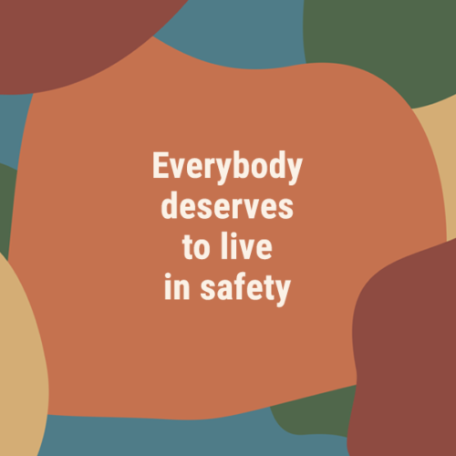
Refugee and Immigration Legal Service
Creating a new visual identity for a non-profit organisation providing free legal assistance in immigration and refugee matters
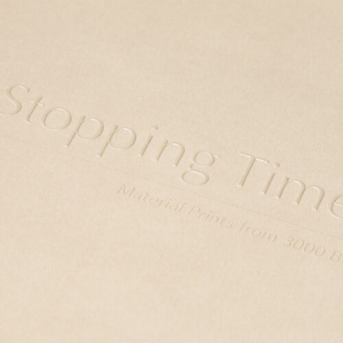
Stopping Time
Celebrating print with a exhibition catalogue featuring printmakers from 3000BCE to now
Bachelor of Design
Cutting through the clutter to promote the Bachelor of Design program at Queensland College of Art, Griffith University
That’s Rad! Science
Promoting STEM to kids through fun and engaging stories
POP Gallery
Creating a new identity for the external Post Graduate gallery for the Queensland College of Art, Griffith University
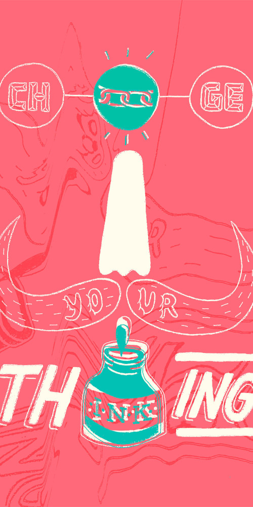
The Australian Cycle Alliance
Rebranding a rapidly growing grass-roots cycling advocacy group
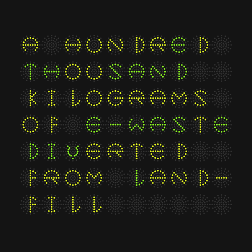
From The Ground Up
Collaborating with Griffith Review and the Policy Innovation Hub to create an interactive story around the good work of Substation 33
Iranian Film Festival Australia
Assisting a national film festival to gain a wider audience and understanding of Iranian culture through cinema
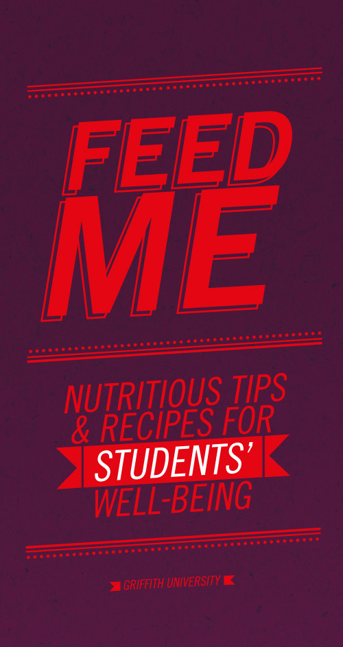
Feed Me
Developing a vibrant and dynamic cook book to educate new university students about the importance of nutrition
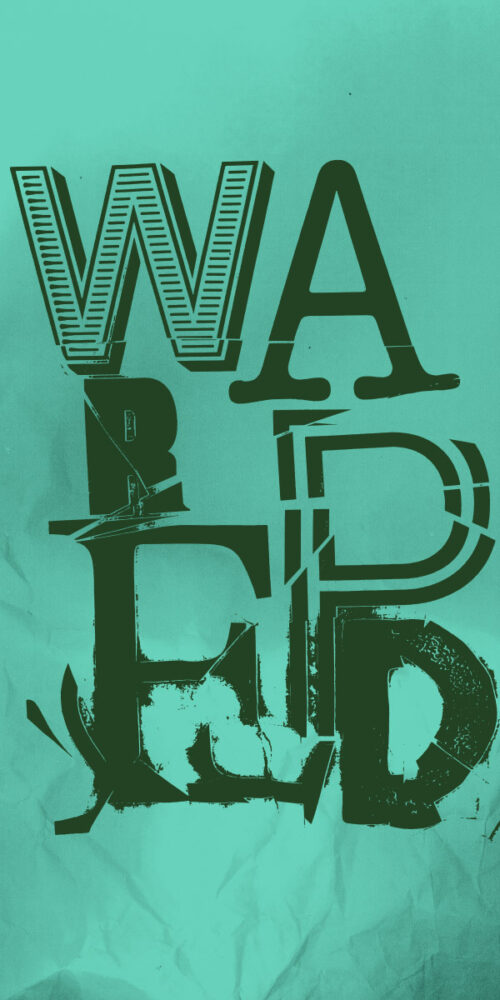
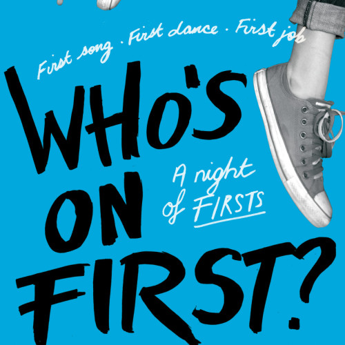
Who’s On First?
Working with a very small budget to promote the first ever Bachelor of Musical Theatre performance at Queensland Conservatorium, Griffith University
Milaana
Assisting a youth orientated social enterprise promote community engagement opportunities to students and recent graduates
Be Me
Promoting mental health and well-being to younger Australians
Yang + Shaw
Identity for a jewellery and small objects exhibition at artisan Galleries
Project Unite
Communicating a larger police presence and promoting public awareness leading up to and during the 2018 Gold Coast Commonwealth Games
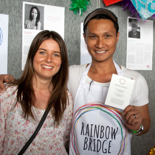
Rainbow Bridge
Providing crucial information to Queenslanders of Culturally and Linguistically Diverse backgrounds who identify as Lesbian, Gay, Bisexual or Transgender
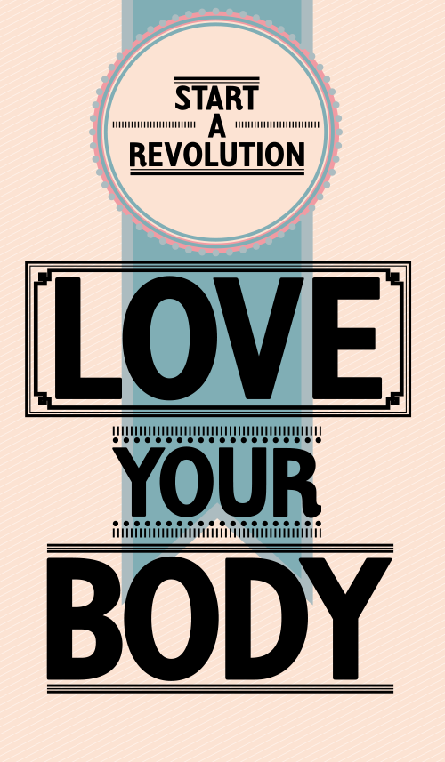
Consume Youth Magazine
Promoting positive body image, health, tolerance and personal responsibility to Queensland high school students
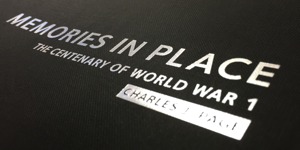
Memories in Place
Design layout for Memories in Place: The Centenary of World War 1 by documentary photographer Charles Page
Residential Tenancies Authority
Redesigning important documents to better communicate rights and responsibilities of renters
Queensland Symphony Orchestra
Updating an identity to attract a younger audience